Partner Portal

A web-first portal designed for Insurance agents & Bank branches
OVERVIEW

The objective of this project is develop a one stop solution for partners belonging to all different distribution channels. The application shall have major functionalities to provide real time view of their proposals, handy access to information related to policies due for renewal, view commission statements, request endorsements for customer policies and file claim on behalf of the customer.

ROLE & DURATION
UI/UX Designer | Gemini Solutions
User Research, Interaction, Visual design,
Prototyping & testing
Nov 2017 - Jul 2019

The Problem Statement

There was a lack of a one-stop, robust digital platform for distribution channels in the insurance sector. Major gaps needed to be filled in terms of functionalities. I along with my team designed & developed a web-first application to cater to a wide range of business needs of partners across hierarchies.

Research

I along with my team did different types of research like competitive analysis, technological research and design trends around the globe. I researched on the competitive brands and what technologies they are using in their digital products. I also did extensive research on the designs of various kinds of dashboards being used in Enterprise products. I read what all data sets are being showcased by other companies catering to insurance, and how they are visualizing the data to make sense of it. I read about the variety of new technologies being used in large-scale webapps and websites that make the product more robust and easy to use.
dashboard-example
dashboard example
dashboard example
dashboard example
No items found.

Wireframes

I was solely responsible for working on the designs and wireframes, while simultaneously assisting developers on how to get the desired product. There was constant communication with the client for designing scenarios of various modules for the product. I visualized the wireframes of different modules of the product, based on the type of data to be showcased. Every module had a certain set of data and the wireframes were created keeping them in mind.

The home page / dashboard wireframe was divided into segments, the first one being the navigation- which was sticky on the left with links to different modules. The right segment of the screen space was divided into cards of different sizes depicting graphical data of proposal, policies, claims and the actionable items for a user.

Another wireframe was designed with the vision of showing multiple records for various modules such as proposal, policies and claims etc. The design of this screen was kept tabular with an option to filter data being showed in table.

The profile screen was designed as a single card with data being distributed based on the hierarchy of the data set. The different types of data in profile had their corresponding headings to make it clear and simple for the user to understand.

The very first idea of knowledge bank was to create a file explorer like structure with breadcrumbs, folders and file preview. Knowledge bank wireframe was also a simple design with the icon of the type of data and title underneath it. Different icons were provided for folder, files, video and other data types
Wireframe-dashboard
policy wireframe
profile wireframe
profile Knowledge Bank
No items found.

Dashboard

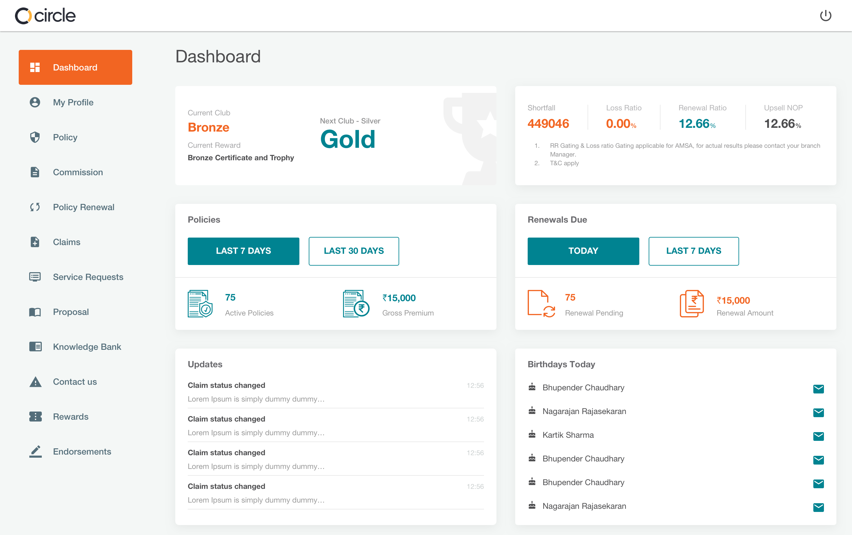
I with my team designed the dashboard to showcase different business metrics. The dashboard design took a transition from being a data heavy wireframe to a clean and minimal design. I along with my team tested out the wireframe across different user groups of agents & partners, based on the findings a new design was created.

The data set was distributed into cards of variable sizes. The first two cards showcased the current standing of an agent and the business metrics that affect the current standings.

The cards showcasing the number of policies and renewals for select period of time were kept simple and clean without any graphical data.

The last section contained the card with the updates to be taken care of by the agent and card for displaying birthdays with an option to send wishes via email or SMS.
Dashboard

Profiles

The requirement was to have four profiles for target users – agent, bank branch, sub-broker and main broker. All profiles were made with different set of data metrics aligning to the respective hierarchy.

Policy

Policy module was designed keeping in mind the enormous data present in the system. I designed a tabular view for all policies and expanded version to view the detail of single policy. The data table was also given the function to filter on the basis of status (active/cancelled/dispatched) and product type. The functionality to export data into excel was also provided. The user could also search the data table using policy holder name and policy number.

The detailed view of a single policy contained all the data points that were given to us by the clients and I divided this data into different sections inside the detailed view catering to different categories of data

Commissions

Commissions module was designed to give a larger view on the performance of a partner or an agent by providing the metrics that specify the commissions accrued by an agent and total deductions on his/her end. I designed the screen keeping in mind the data will be shown to the end user in a graphical format so that it was easy for the user to get an idea of how good he/she performed. The data was divided into 3 major parts the first being the graphs representing the commission accrued in a fortnightly, the second one is the option to view & download the commission statement and last one a table showcasing the commission earned in recent proposals.
commissions

Claims

Claims dashboard was designed with a tabular view in mind showing all the claims filed sorted on the basis of claim raised date of each policy number. We also designed a detailed view of each tabular data showcasing the type of claim and other data metrics corresponding to claim.
claim-dashboardclaim-details
There were actions provided on the screen to file a claim and to intimate a claim. Both the flows had different layouts and workflows.

Knowledge Bank

I along with my team designed knowledge back which is similar to a file explorer, so that users get a sense of familiarity. To make the functionality user-friendly, I added product-specific icons and added a universal search across the Learning module

Rewards & Recognition

Rewards & Recognitions was designed considering aspects like bonus and loyalties which users get on achieving a certain target goal. We also designed a timeline which showcased currently achieved points and the achievements that can be gained by the user going forward. Rewards and recognitions had a combination of different banners for several competitions happening in the firm. This module gave the user a sense of achieving more and working hard towards being at the top of leaderboard.
rewards & recognition

Credits

UX Manager
Prateek Saini
UI UX designer
Rajat Bhandari
UX Development
Lalit Kumar, Kartikeya Mudgal
No items found.